Bing News Navigation
Navigational refresh of Bing News
Rethink a modern navigational design for Bing News
During the internship in Microsoft, my primary project was to perform a systematic exploration of navigation system for Bing News.
Highlight
1° Built a simple evaluation framework and compared the old design with 16 category competitors.
2° Performed dedicated design exploration.
3° Conducted a usability test between the new and old design, and it showed a significant result.
4° Due to the complete results, I received 9/10 in the internship evaluation.
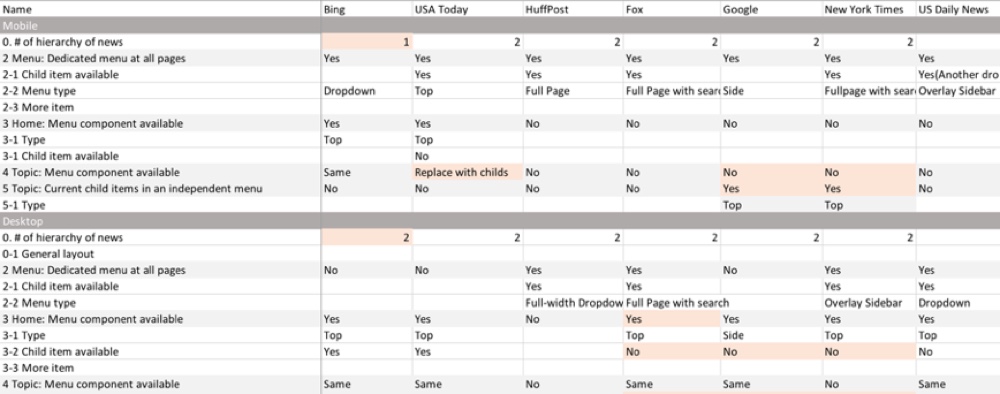
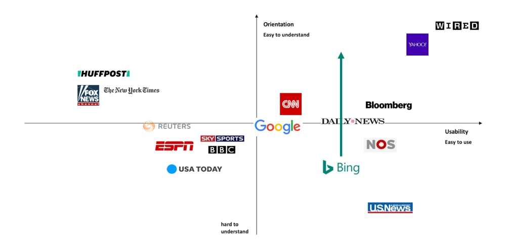
Evaluation and competitor analysis
A fast literature review is performed at the beginning of the project. Since navigation is an established HCI topic, it has a clear definition of "good navigation design". The two metrics are:
Usability (Easy to use)
Firstly, visual complexity is an obvious metric. The more items showing on the screen, the less usability it is (Kitajima, Blackmon & Polson, 2000). Also, due to the eye movement, the position of the menu will influence usability as well (Webster, Jane, and Jaspreet, 2006).
Orientation (Easy to understand)
Orientation is more about whether the user can understand the structure the website, and thus avoid to feel missed during browsing (Webster, Jane, and Jaspreet, 2006).
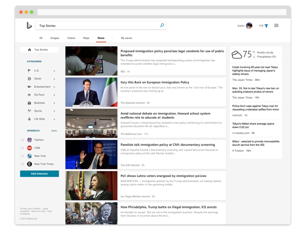
And based on the framework of the two sources, I built a framework to evaluate the performance of the menu. I collect the category competitors of Bing News, which includes direct competitors (news platforms, e.g. Google News and Yahoo News), and indirect competitors (news publishers, e.g. Bloomberg and CNN).
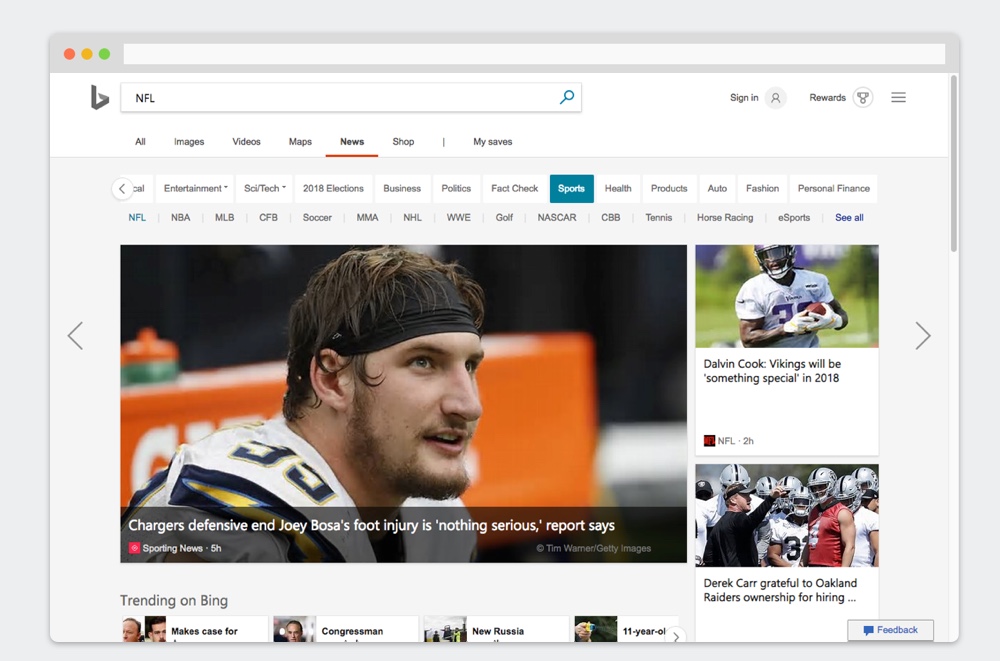
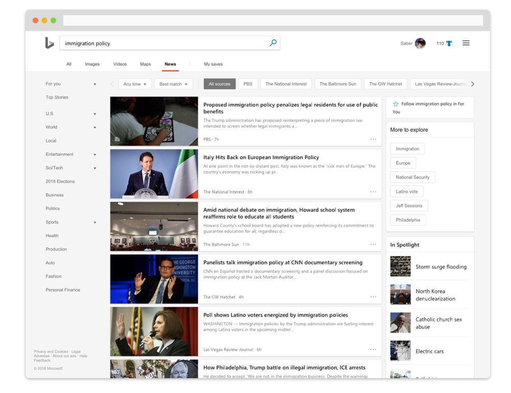
Evaluation of desktop interfaces
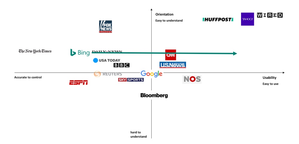
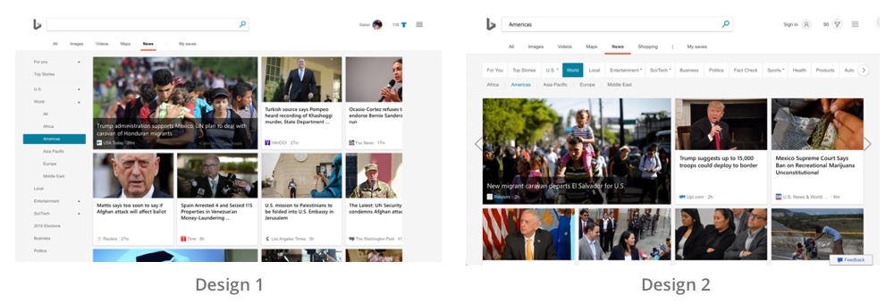
Bing has better orientation but worse usability due to the numbers of items on the menu. I propose to (1) rearrange the structure of the menu to achieve it and (2) provide an overview of all items.
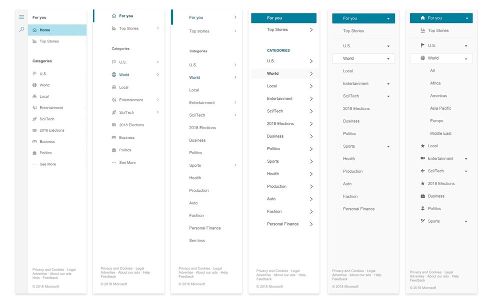
Evaluation of mobile interfaces
The weakness of Bing News mobile is worse orientation due to the complex interaction of the menu. I propose to (1) improve the way to organize the items.
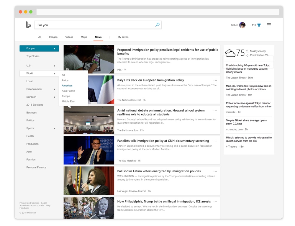
Preliminary design exploration
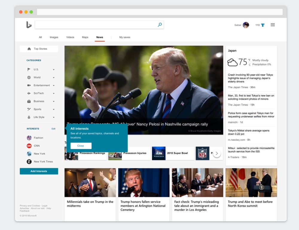
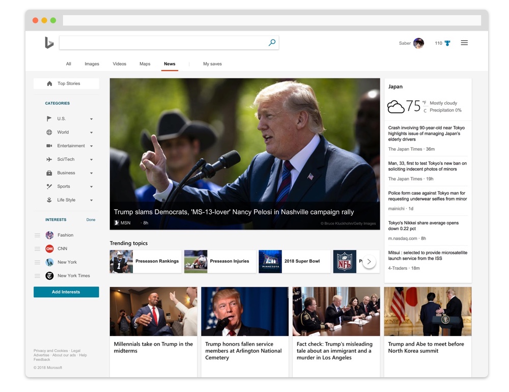
With the conclusion, I performed a series of design experiments such as layout, item groups, and style. Style, for example, is a focused part of it. In the internal design guideline of Bing products, there is no specific definition regarding navigation. Therefore, I tried to leverage the different elements from the design library of Microsoft family including Office series (left 1).
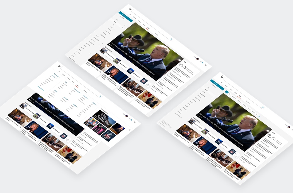
As a result, there are three variances are proposed, including Top (navigation with a dedicated item panel), Side (navigation on the side with collapsable sub-items), and Duo (navigation on both side and top. Side is for parent items and top is for child items). Based on the information from the PM team, we select side to proceed with the further design exploration.
1. Desktop proposal 1
This proposal uses the same language as the old design while it applies the different layout. I use button components and collapsible design to make this proposal.
There are two major changes in the version: (1) I separate the functional items (for you and top story). and topic items (U.S. and sport) (2) group several items together to reduce the number of items (3) refresh the filter control.
2. Desktop proposal 2
Compared to the previous proposal, I add icons for each parent item. With these elements, it makes the collapsible side panel possible. When the menu collapsed, only the icons appear, and users could focus on the content more.
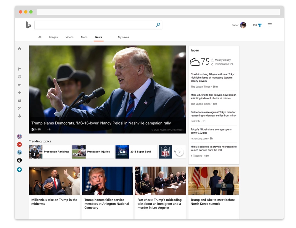
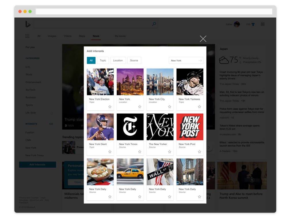
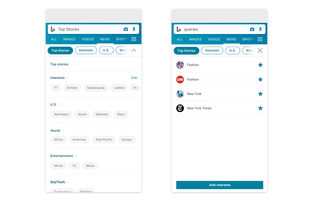
I also further develop interest management. User can order, edit, add topics by selecting a location, publication, and ongoing issue.
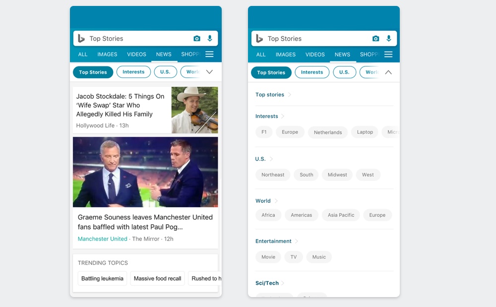
3. Mobile proposal
I apply the newly defined selection components to mobile navigation. User can slide the parent items without expanding the menu. Once the menu is toggled, the child-item becomes possible to be selected.
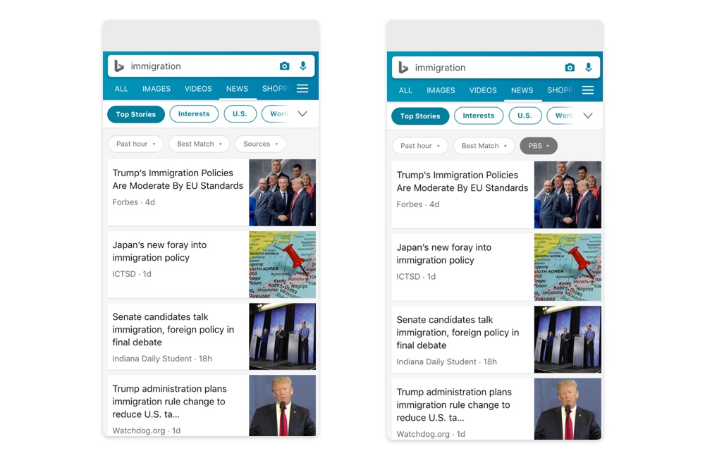
The filter control in the mobile environment is also introduced. I used the secondary buttons to visually separate them from the menu with parent-items.
Similar to the desktop design, personal customization feature is improved in the new design. The user can customize the items in a dedicated panel.
Validation
To validate the new design, I conducted a remote usability test with 8 participants from European and American countries. I recorded their screen and measure the interaction time of each task and transcribe the feedback they share.
In the test, there are two sets of variances, The first is the new design (Design 1) and the old one (Design 2).
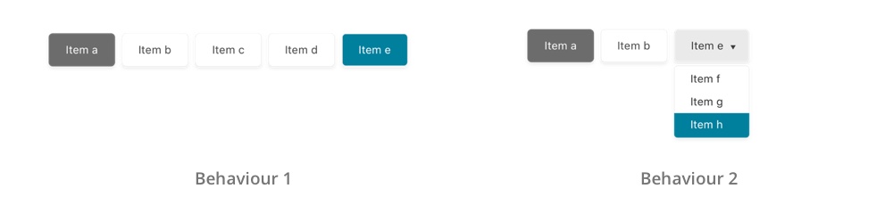
The second variance is behavior. Since Bing News has a complex structure, I evaluate two major actions when interacting with the menu: selecting a parent item which is three items away (Behaviour 1), and selecting the third child item in a parent item which is two items away (Behaviour 2).
Since the test is a remote test, I create a fully interactive prototype for the participant to interact with from their browser.
In the test, the participants start from a simple introduction and then do 2 tests (either Design 1 or 2) with 8 tasks (either Behaviour 1 or 2) each.
At the end of the test, the participant is invited to share their thoughts regarding the two design.
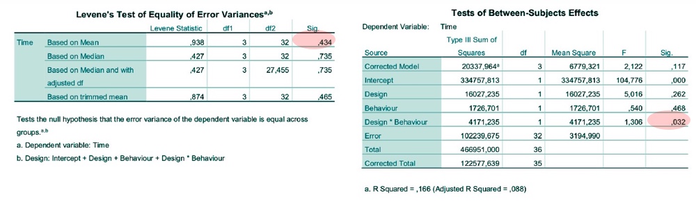
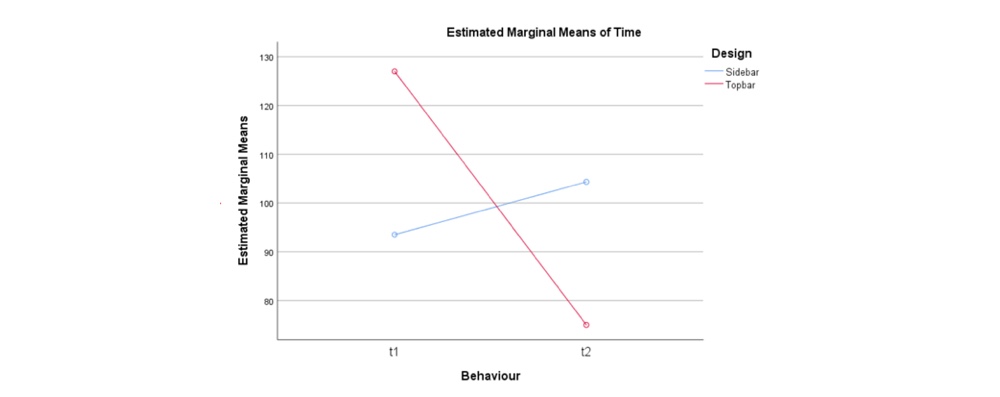
The result passes the Levene's test and thus shows homogeneity. Also, the interaction between Design and Behaviours is significant.
Each design shows the different strength in the test. The new design is easier for the participants to find the parent-items. However, the collapsible design makes the users feeling missed. They can't locate themselves when an item is toggled or closed.
Test conclusion
1. Change the content to list view
Since the experiment is limited to the menu, the content area is not considered. However, in the feedback session, several participants argue the layout is too complex for them to scan the content in the card view. It is strongly recommended to use list view if Bing News adopt a side-bar menu.
2. User the drop-right menu instead of the drop-down menu.
Collapsible menu for sub-item doesn't work well when there are too many items. It may be more useful to use a drop-right menu for the purpose in terms of interaction time.